
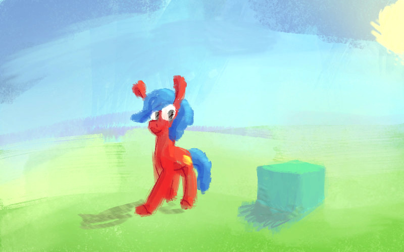
 Hi there! This is the first guide I've written here, so I hope you enjoy it! If you have any questions, comments, or other suggestions, please let me know so I can update this page.
Have you ever looked at a piece of art and thought "Dang, the lights and shadows look so luscious and rich. How did they do that?"
Well if you have, the answer probably includes hue shifting. This is a technique where in lit areas the hues are shifted towards the colour of the light, and in shadows hues are shifted away from the light.
Hue, Saturation, Value
Since we're talking about 'hue shifting', I should explain what 'hue' means – as well as some of the other terms and words I'll be using.
Colour
To me, this is a combo of a hue, saturation, and value. But when artist talk about colours, we also can just mean the hue. It's a bit confusing. For example, I'd say that and are different 'colours', even though they're just different brightnesses…
Hue
The 'colour' part of a colour. All of these are the same saturation / value, but different hues:
Saturation
How intense the colour is. All of these are the same hue / value, but different saturations:
Value
How light or dark a colour is. All of these are the same hue / saturation, but different values:
 The less-saturated colours look so dull and ugly, even I can't stand it!
 Everything has its place, darling – just wait a little while.
The Colour Wheel
Here's the colour wheel:
There are a lot of colour wheel variants, but this is the one we'll be using in this guide.
As we move around the wheel, the hue changes. And as we move towards the centre the value gets higher (things get lighter).
Warm and Cool Colours
The main way to split up colours on the wheel are into two sections, warm and cool. Imagine a line going through the wheel from pinkish-red, through the middle, and to blueish-green. The side with red and yellow in it is the 'warm' side, and the side with blue and purple is the 'cool' side.
Warm
These are supposed to feel warm and bright! Like fire, or going on an exciting adventure!
Cool
These are supposed to feel cool and damp, like you're sitting under the stars.
But!
How cool or warm a colour is depends on context! Where it is in the picture, the colours around it, and even more. In particular, cool colours are usually less-saturated than warm colours when you use them. In traditional painting kits you normally get a set of warm and cool colours to play with, with the each one's hue leaning towards the warmer or cooler side of the wheel.
Cool and Warm Reds:
Cool and Warm Yellows:
Cool and Warm Blues:
 Wait, why do we need to know this?
 Well this affects how lights and shadows work, darling! Lit areas are usually warm and shadows are usually cool. We use hue shifting to show these differences more naturally on the objects in our scene.
Hue Shifting
Finally! At the most basic level, hue shifting can be summed up as:
- In lit areas, the hue shifts towards the hue of the light source.
- In shaded areas, the hue shifts away from the hue of the light source.
Let's dive into this a bit more.
Example Spheres
Take a look at these two spheres:

The top sphere's shaded areas get a darker value and the lit areas just get a lighter value. Nothing too complex, just moving towards black and towards white:
The bottom sphere's shaded areas tint towards red, and the lit areas tint towards green. This makes it look like the sphere's being lit by a light, cool-ish light source:
Because we're shifting the hue, we also don't need to change the value as much to get the same visual effect.
Colour Examples
In this section we'll have a few lights and example objects. The hue shifts here might be a bit exaggerated, so feel free to shift more or less in your own pictures. We'll also include a small colour wheel alongside each section for reference.
Yellow Light
This is the colour of our light source:
So the shadows for this light source would be:
Let's say we have a red object:
This could be a wall, a sphere, a cube, or a pony's coat! If we look at our colour wheel, the lit areas will tint towards orange and the shadow areas will tint towards purple.
Compare:
Shadow Light – with hue shifting
vs
Shadow Light – no hue shifting
The effect is subtle, but noticable when applied across your scene. Your shadows and lit areas end up looking much more dynamic, interesting, and natural. It also helps it feel like your light source is actually interacting with your scene.
Let's say we have an aqua object:
If we look at our colour wheel, the lit areas will tint towards yellow/green and the shadow areas will tint towards blue.
Shadow Light – with hue shifting
vs
Shadow Light – no hue shifting
Here's an example scene painted up with this light source and some very subtle hue shifting:
Blue Light
This is the colour of our light source:
So the shadows for this light source would be:
Let's say we have a pink object:
If we look at our colour wheel, the lit areas will tint towards purple and the shadow areas will tint towards red/orange.
Shadow Light – with hue shifting
vs
Shadow Light – no hue shifting
Let's say we have a green object:
If we look at our colour wheel, the lit areas will tint towards aqua/blue and the shadow areas will tint towards yellow.
Shadow Light – with hue shifting
vs
Shadow Light – no hue shifting
And that's how you integrate the light source into your scene, darlings. I think I'll need to see this being used in an actual picture to compare…
More Examples
From viw's shading guide, here's some art from Hobbular:
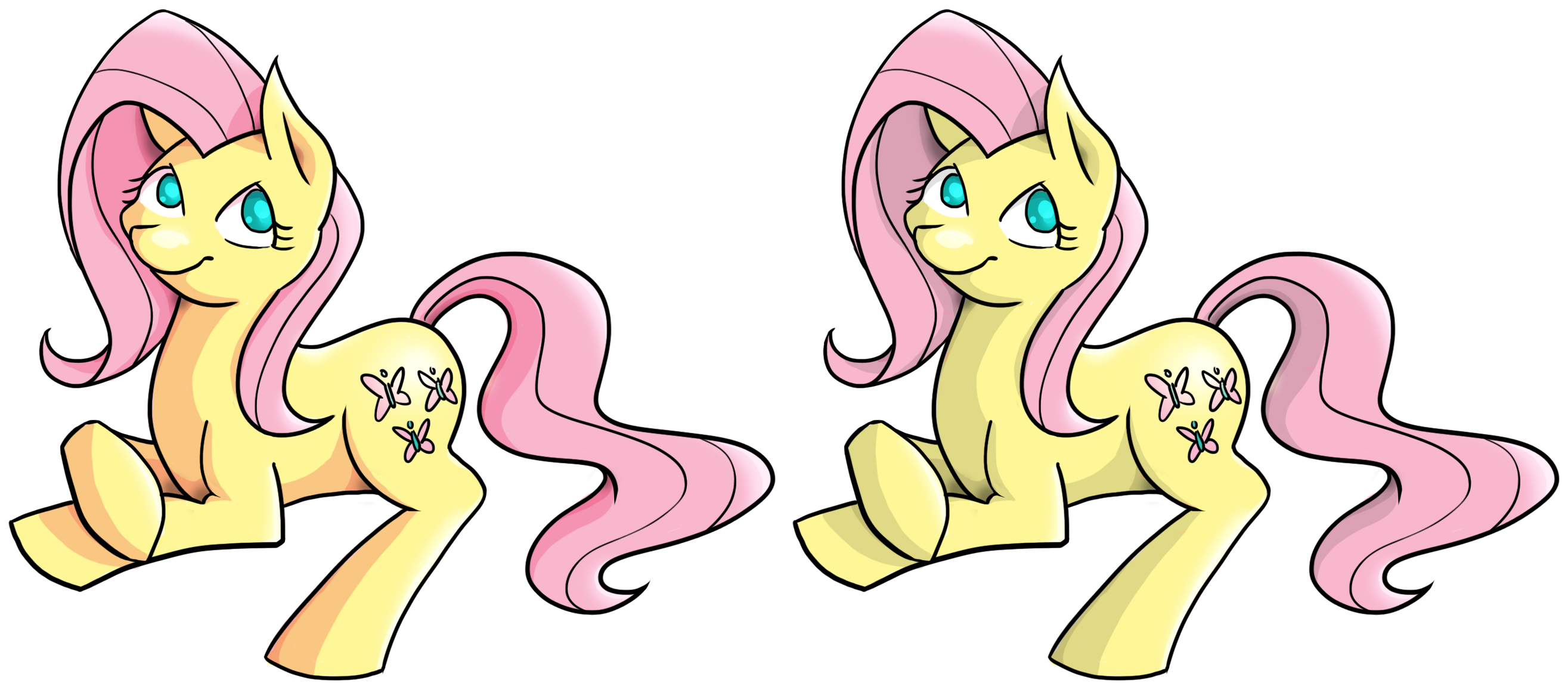
On the left image, you can see the hues being changed in the shaded areas of Fluttershy. On the right image only the value is changed, so it ends up looking washed-out.
 Hot dang, Fluttershy. Nice hue shifting!
 I agree, darling. Wonderful work.
 Th-thank you girls…
Videos
In Conclusion
While you're painting:
- Keep the colour of your light source in mind.
- If you have multiple light sources, try to figure out how the effective colours change – and in which parts of the scene they'd merge and where they'd stay separate.
- Use that to determine the hue/tone your shadows would take on.
- Shift the hues in the lit areas towards the hue of your light sources.
- Shift the hues in the shaded areas away from the hue of your light sources.
And that's about all you need to do! Go out there and use some effective colours!
 Wow, that was a mighty helpful lesson. Ah learned a lot!'Ah'? Dear, you don't need to write in your accent, I'm sure they'll be able to get it themselves.