
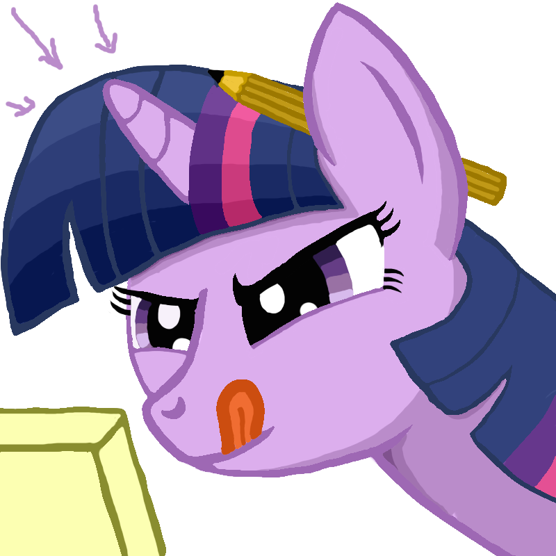
 I am Twilight Sparkle and I'm here to help.
Hello again my little artists, Its time for another edition of viwrastupr's giant text wall. Hopefully Twilight and the examples make this easier on all of you. This guide has three parts.
- Planning stuff
- Elements of placement
- Methods to make
 Art is a lie that tells the truth.
There are many different ways to set up a composition and planning can mean the difference between something being anatomically accurate or being interesting to look at. The purpose of this guide is to teach you to plan and play with composition and how There's a whole bunch here, but it is interesting stuff to consider. And it gets those creative energies going and gets you thinking about art in a whole new way.
Part 1: Planning your Picture
Variety
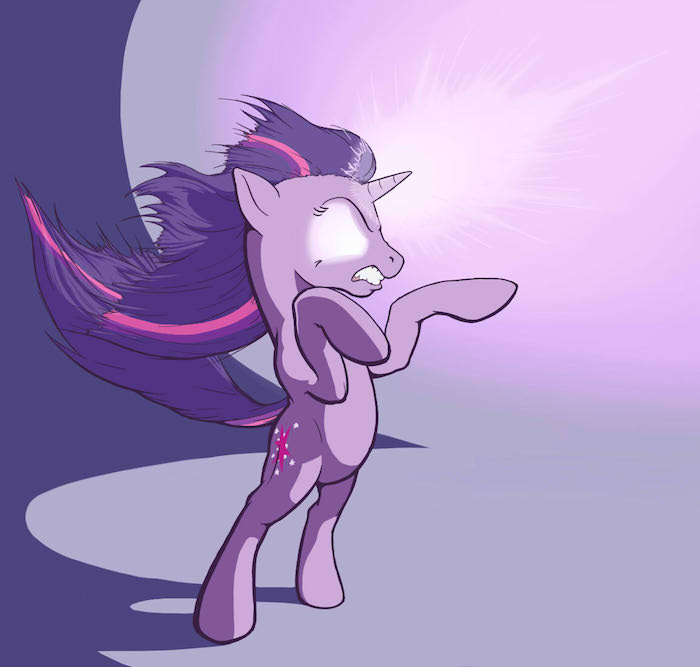
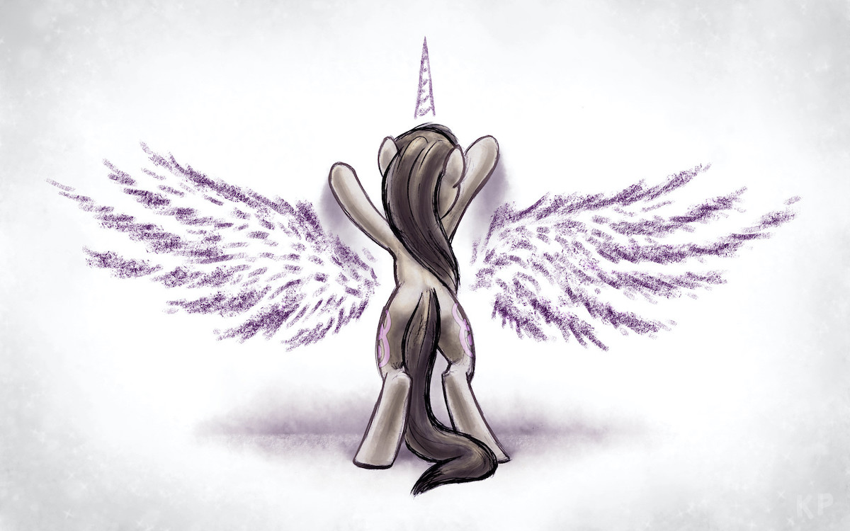
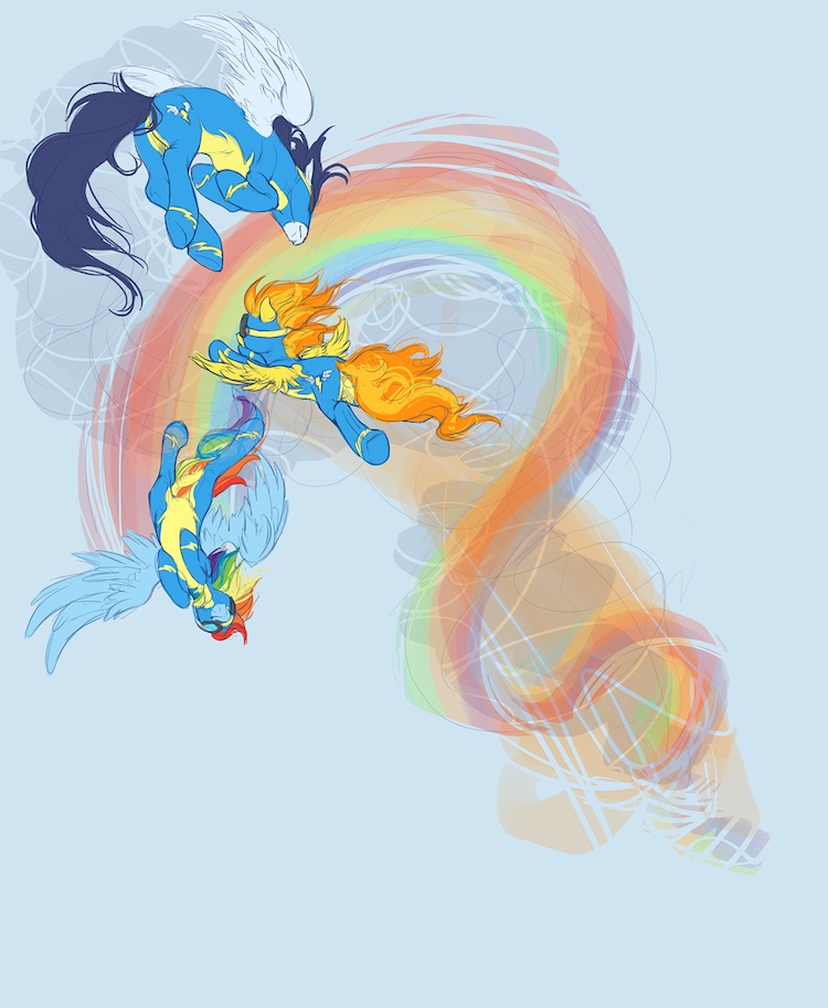
How many different elements do you want? How different should they be? Adding variety to a piece gives different kinds of attention to different parts. Notice how each limb on this Twilight is going a different direction, and how her body's facing a different direction than her head:
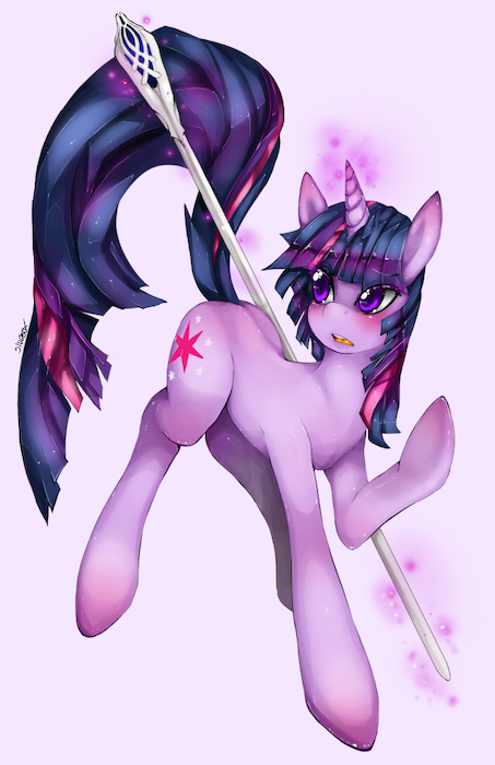
Variety creates interest. This is not only true of positioning, but also of texture, value, mark making... a lot of stuff
Conformity
Adding conformity adds stability, repetition, it lets us compare more intricate details. This is usually not an issue for newer artists as our brains default at horizontal and vertical...
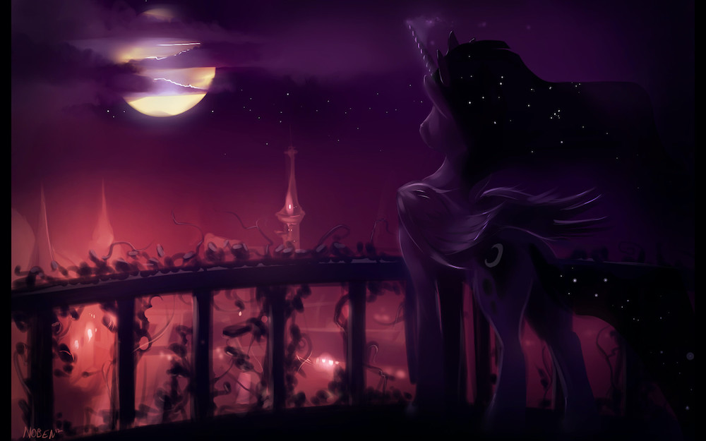
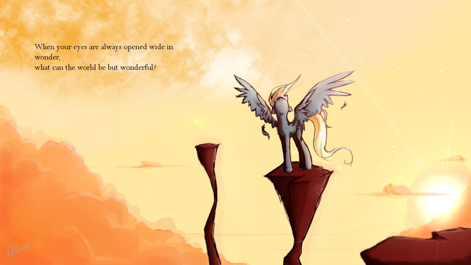
 Horizontal and vertical lines have their place, but for newer artists it is best to play with diagonals and actions, try to get things interesting.
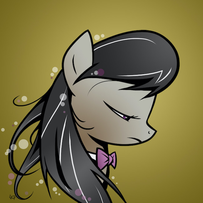
Otherwise known as the most boring things in art. To be avoided in the beginning, to be used only with intention. This picture shows very well how a vertical line can be used for stability and emotion:
Balance
 What?
What?Is there as much on the left as there is on the right? No? (good) Then why? What is it doing? Something to ask yourself during the creation process. Colors, value, texture, busyness of lines, placement. All these things are a factor of balance. A good contrast of two values on two separate sides is a neat balance, but sometimes you don't want it even:
Emphasis
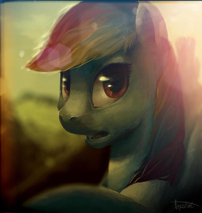
Defined by balance. Where do you want the viewer's eye to look? Is there contrast there? Is there an eye? Is it busy? Is there a different color? Where do the lines point? Then how do we know to look there? What is the first thing you notice with this piece?
Contrast
Tells us where things are different. You may say that 'duh things are different because they're in another spot'. Well, our eyes don't know that. A big problem early artists have is either being dependent on outlines or blurring everything together to make mud.
This is especially true of shadows. We need to know that the shadow is different from the body. That the background is different from the foreground. That the leg is different from the body. Contrast creates space and depth. It is the contrast of the different shades and values and colors on this Dash that gives her the 3dish feel:
Rhythm
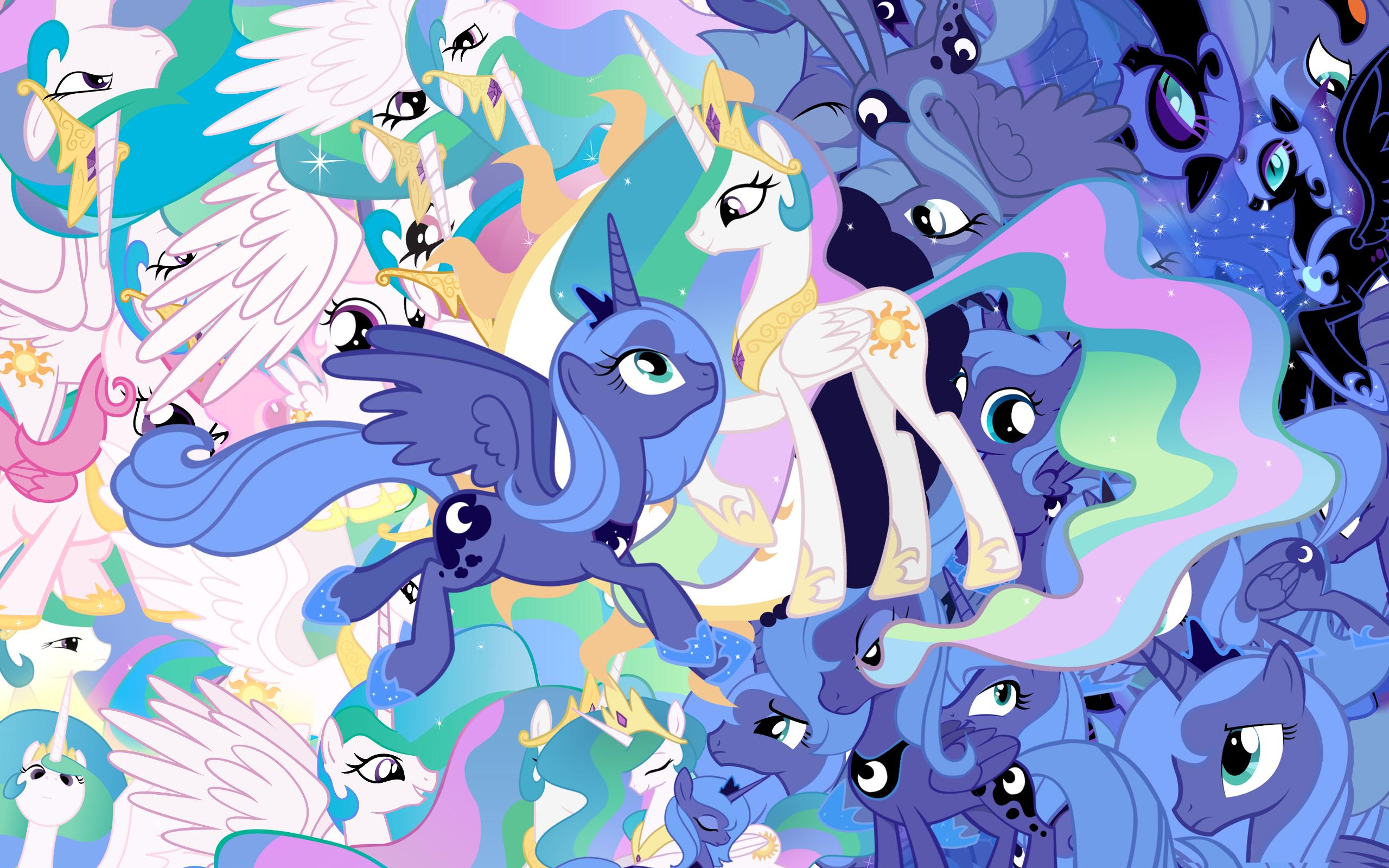
Repeated elements, these can be anything from trees in a forest to characters. Here, it's the characters themselves:
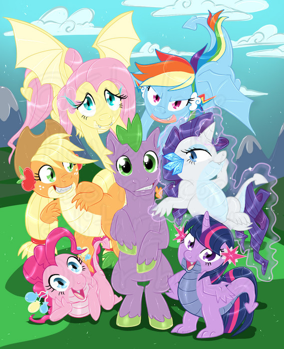
Rhythm creates a sense of unity and pulls a piece together, defining what it is about or where it is or other unifying stuffs.
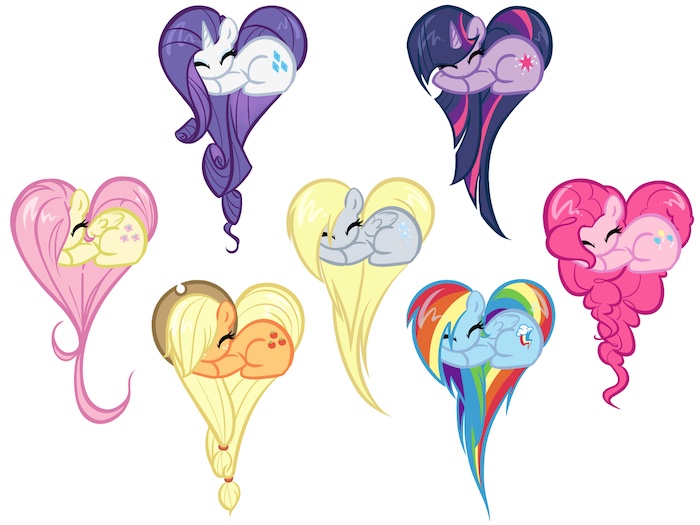
Repetition
What's the difference between repetition and rythm? A pattern is much more alike than a rythm:
Scale
How big the pony (or whatever else you want the viewer to focus on) is makes it more or less important to the composition. Notice how the background characters here are smaller than Dash:
Figure/Ground relationship
Separating your figure from the background is ludicrously important. The 'figure' is what people should be focusing on, and the 'ground' is the background.
How you show this tells the viewer what is important and what is not, and it also gives them a sense of space. A lot of people use outlines for this purpose, but there are ways to do it with shape, value and color. This piece shows the figure and group separated by value:
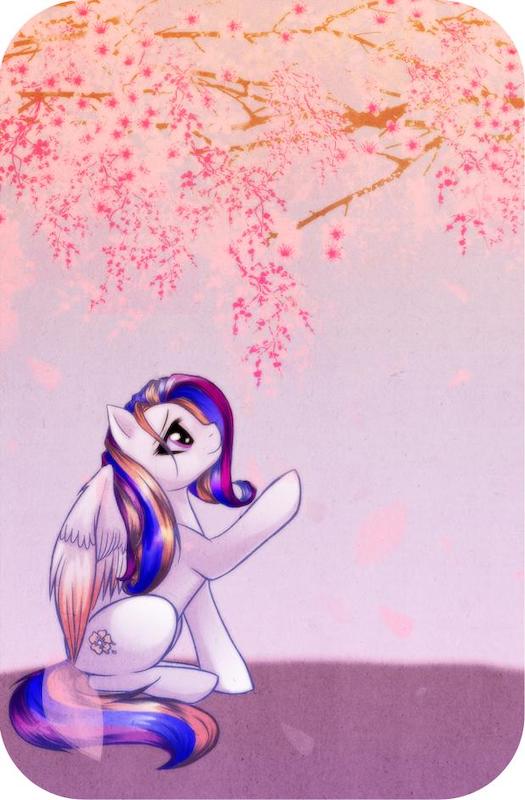
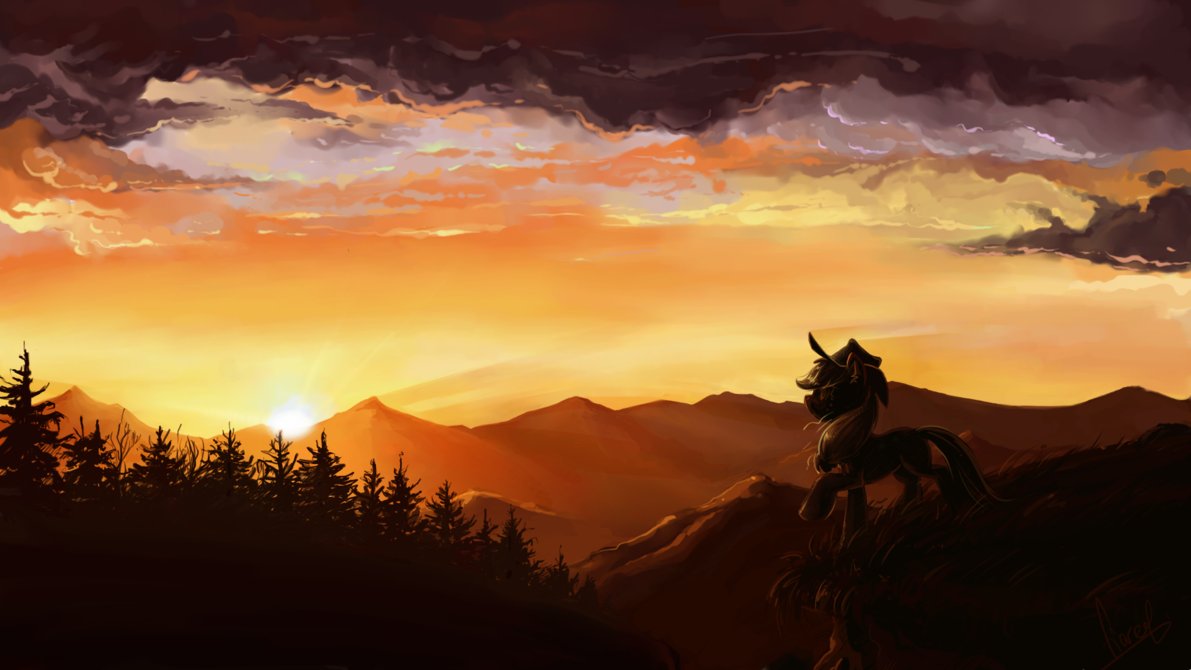
Direction
Gaze, gesture, prominent lines of contrast… Our eyes follow gaze and gestures. It is implied line. This piece does both, pointing out the beauty of the branches above:
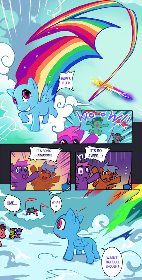
Movement/Action
Diagonal lines help with these a lot, but it is figural. What your character is doing creates intrigue. Would this be exciting without any movement?
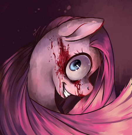
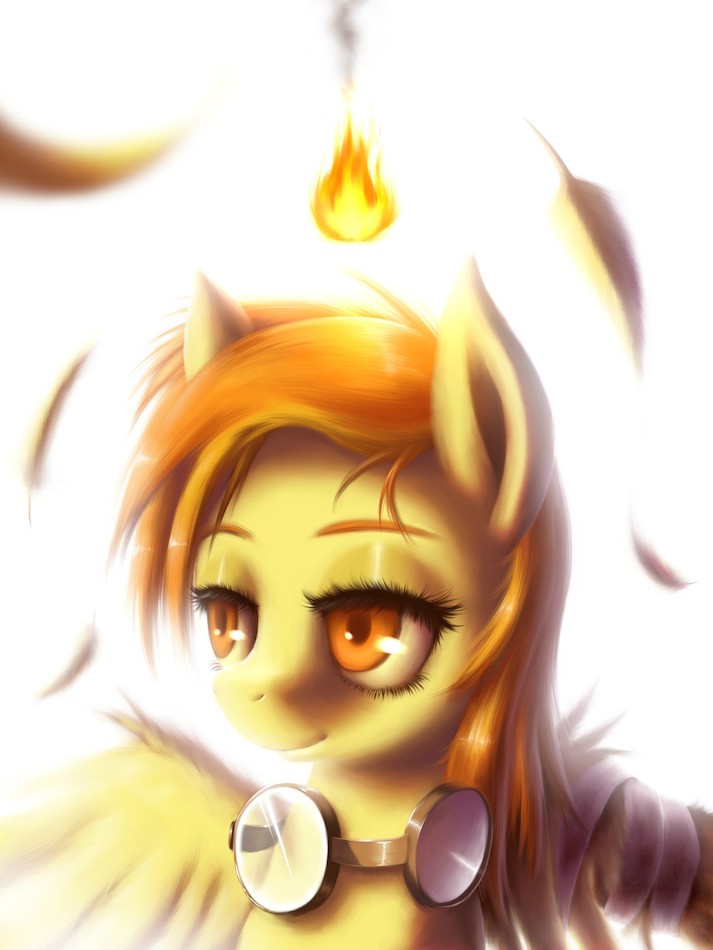
Faces and emotions
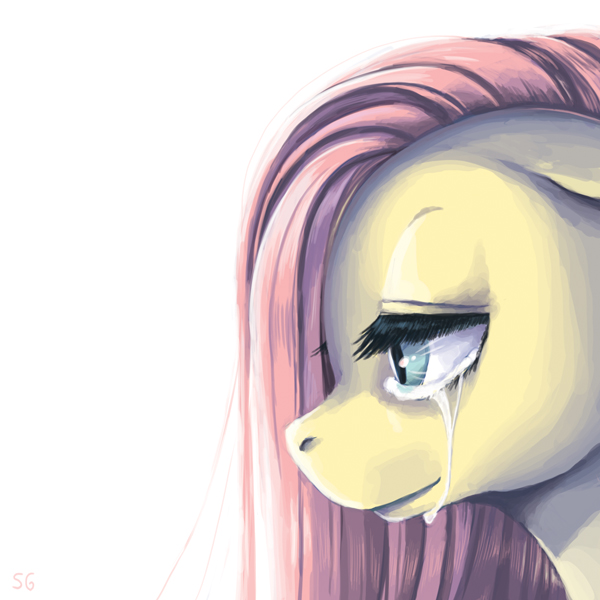
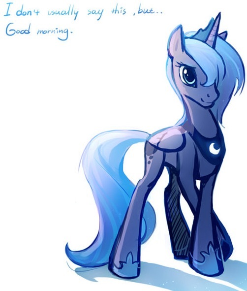
 Emotion me!
Not technically a part of 2d design. But important. Our eyes identify faces fist and start there. Emotions make or break how we view the character:
Also emotions aren't be dependent on the face alone. Value and texture also play an important role:
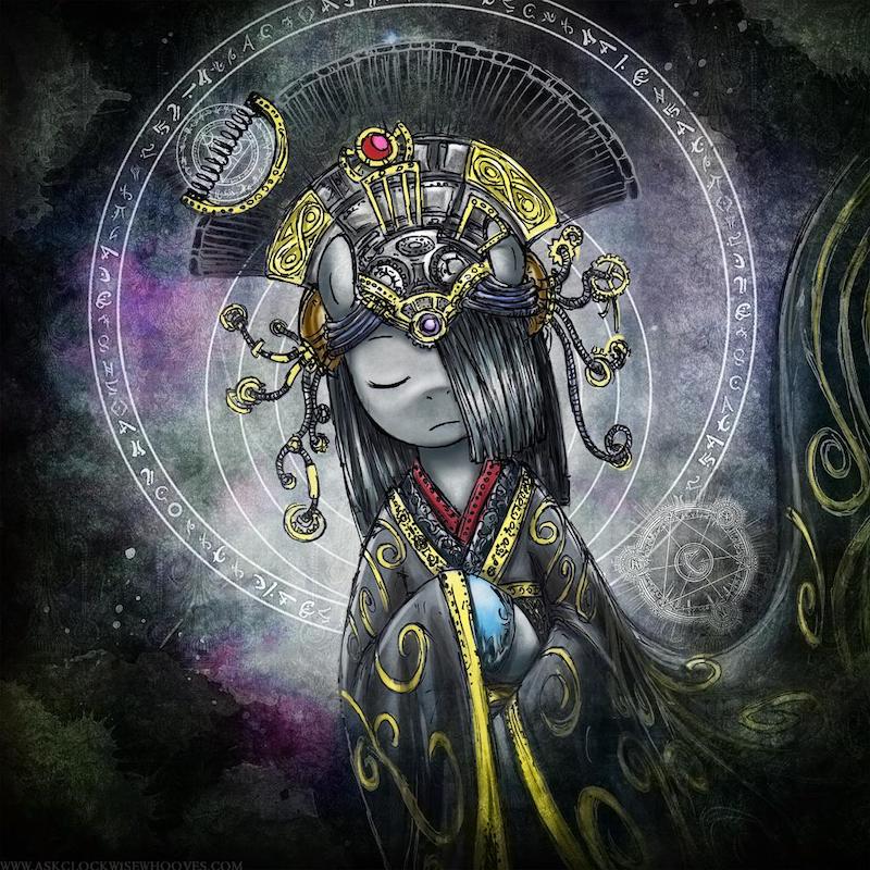
Concept
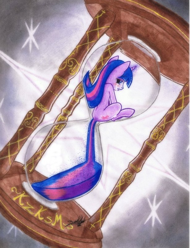
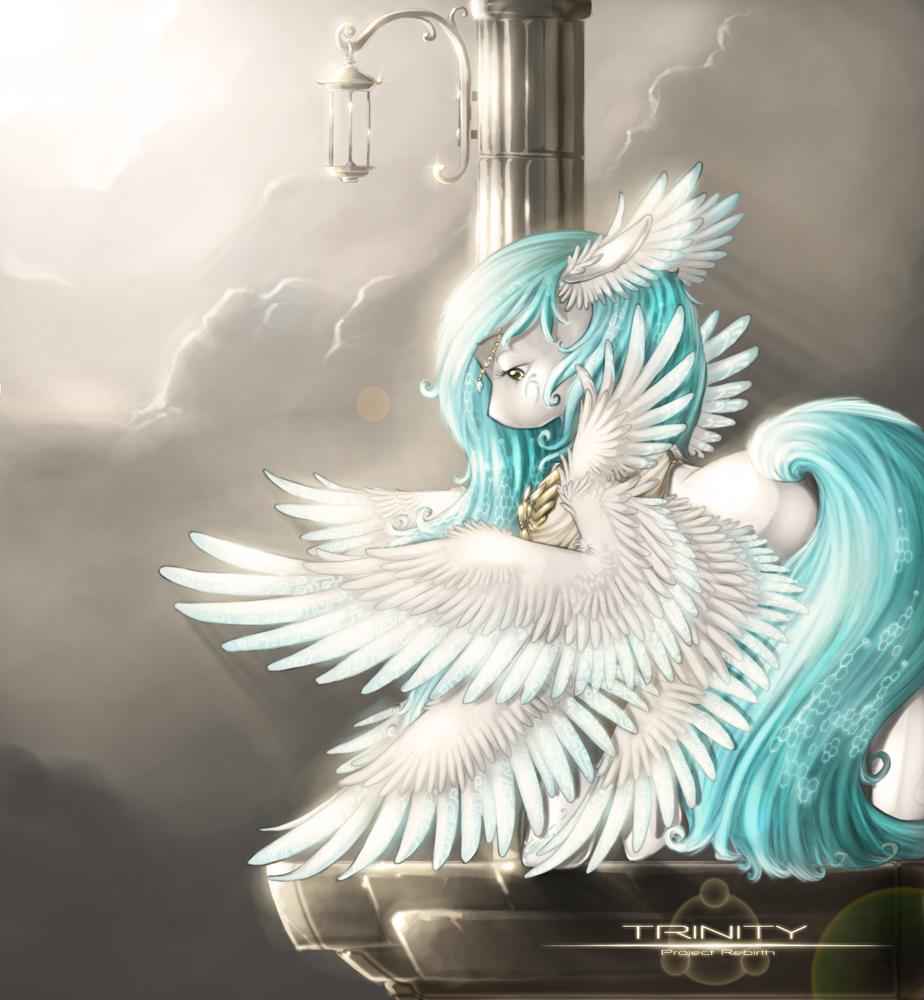
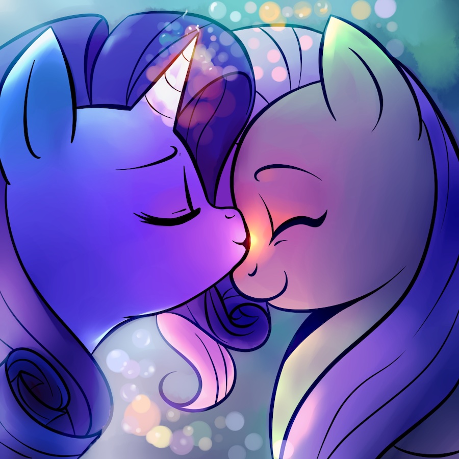
Again, not 2d design, but still really important. A strong concept conveys something to the viewer. For example, this piece overflows with concept:
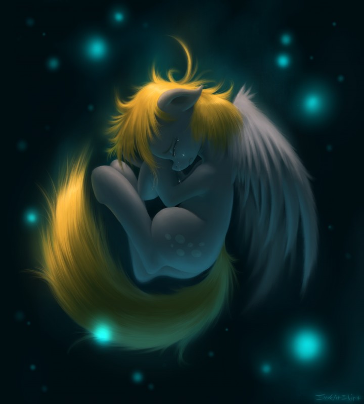
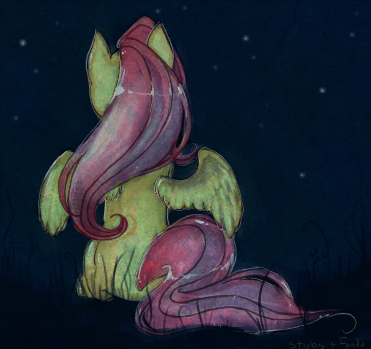
Mystery, implied stuffs. Things that give an attachment to a piece that isn't emotion. This is a piece that does a good job of combining both emotion and concept without showing the face:
Part 2: Elements of Placement
Continuance
Intended or unintended, orientation or implied lines… When you have a line that flows directly into another line or a place of contrast that does the same, or a series of objects in a row, our eyes follow this line.
In this example, the pillar is placed in the same plane as the pony's eye. So when we're looking at the piece, our eyes easily follow it down into the face and the rest of the composition:
Tension
When two objects are very close or an object is very close to the edge it creates tension. Usually this is something to be wary of, creating it unnecessarily. But when done on purpose it can be quite neat. Here, the pony being close to the edge pushes us back into the composition:
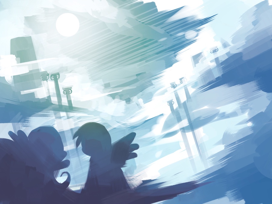
Looseness / Vastness
How much space are you allowing for the figure? This picture shows off the impact of space:
Crowdedness
Can add interest, but also creates confusion. Collages are an excellent example of crowdedness:
Symmetry and Asymmetry
Asymmetry provides interest. Symmetry provides order. Both are good at times, but be wary of order.
 If you don't know that symmetry is... you are making me sad.
The rule of thirds
This is a way that artists divide the composition into three equal parts. Placing important points like the horizon line, the figure, eyes creates more interest for the brain. Wikipedia is better at explaining this than I. Anything about composition that applies to photography applies to art.
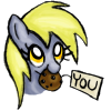
Central composition
This Derpy provides a beautiful example:
This doesn't really qualify for its own bullet but I love Derpy and this is an excellent composition
Part 3: Methods to Make
 What do you mean there's more?
Lines
Known as paths, curves. Everybody knows about lines. We all think that lines are all you make art with. At first. This is line:
Shapes
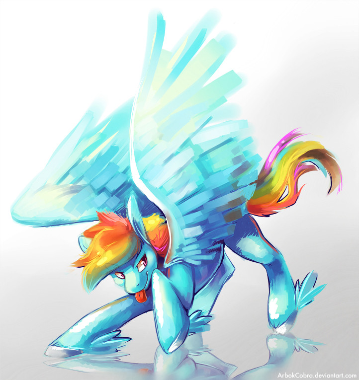
An area! This is what I'm referring to when I say shadow shapes. Shapes are their own volume and learning to create with shapes pushes you into learning to think in 3 dimensions. This Rainbow is mostly made with shapes rather than lines a line brush, and it feels active!
Value
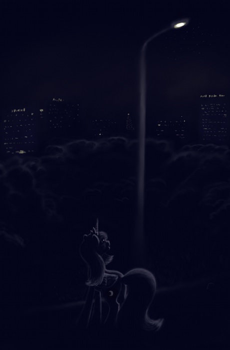
Light and dark. How bright do you want your composition to be? How dark? At first people make things even, trying to get order. Ordered is a dirty word in art. Look at this Spitfire and tell me it isn't beautiful in its brightness:
And tell me the same of this moment and darks:
Plan and play~
Colors!
Basic color theory as seen in this awesome guide.
 Colors. I thought I was almost done and there's a guide within a guide. Jerk
Color is a class of its own. Take this megasweet piece for example – color makes it pop!
Space
Height, width and the illusion of depth. Putting two or more similar objects in a piece gives you ability to play with depth such as with this piece:
Notice how Sorin is bigger and thus seems closer? A large number of horizontalish divisions can also help give an illusion of depth, such as in this piece:
There is also perspective but that's a different lecture
Texture
Texture is very active and draws the eye in to visit all the parts of the piece. It is a good cookie (explained later). This piece would be different if it weren't for the textured background:
Text
Text adds mood, context, and flair! You can play around with specific fonts and give flourish.
Cookies
These are a reward to your audience for looking. It can be anything from a rich texture to an easter egg. You don't notice this on first glance, but the more you look the more you enjoy.
 Everypony wants a cookie. Or a muffin.
These make a good art epic. The texture, the fuzzy background, the wearing of the hat, the holding hooves. This piece is full of happy cookies.
As you can see from the various examples, these elements play together and flourish. Art is infinite and wonderful
This guide here is a 2d design course. There is a lot here so feel free to voice questions, concerns, comments, replies or play with emotes, cause you know, they're emotes. It's fun.
 None of these things were stolen from a 2d design book.
 Feel free to note anything you'd like to add.