A word on Value and applying it to shading
One thing it seems like a lot of people haven't been introduced to yet is the concept of value and how to use it. Value, for those who don't know, is a shade of lightness/darkness, in simplest terms. This is something that is very important to know how to use well in art. Why is this? For one thing, the human eye is MUCH more sensitive to changes in value than it is to changes in color. Don't believe me? Put an image into Photoshop or whatever and change it to grayscale. Still recognizable? Of course it is. Now set the layer to color mode over 50% gray. Much less easy to recognize, isn't it? Understanding how to use value effectively will be very helpful in improving your skill.
How Value is used by professionals
I apologize for the lack of pony in this post, but I'm currently at Panera Bread and deviantart is blocked for some reason, so I'm having to pull images from other sites. I may update this tomorrow if this post gets a good response.
Let's look at a few images that use value well.
Take a look at this sketch by Craig Mullins (master of value and literally the first person to paint in Photoshop):
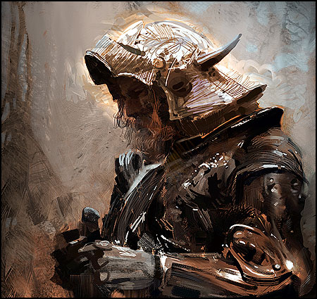
It illustrates a good use of value. How do you know? Squint at the image. Notice how visible the figure is, even from a distance. Things that are farther away from you should almost always be lower contrast than closer things, so notice how the background is composed of much closer midtones, and the foreground, while eclectic, is always contrasting with it and never blending in. Also notice how strong the image appears from a distance, even though it's quite loose on further inspection.
Here's another excellent image from turn-of-the-century master John Singer Sargent:
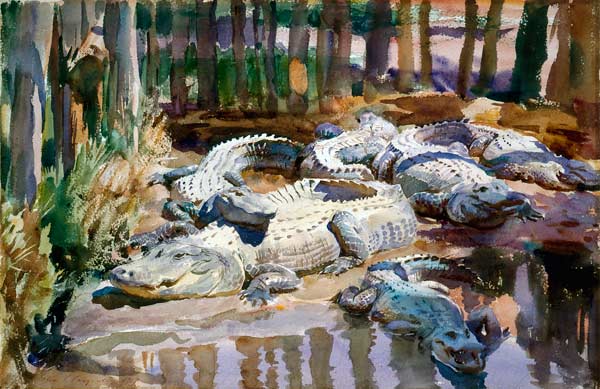
Notice that while from a distance you may be unable to immediately recognize that the subjects are alligators, the forms in and of themselves are readily apparent, even when squinting.
So what's the point of all this?
What, exactly is the takeaway here? That really good painters make really strong images?
The point is that really strong images come about through a good use of value. So what constitutes a good use of value?
Two things:
- Accurate contrast that serves as a focal point
and
- Strong, well-defined blocks of light and shadow.
The first one, unfortunately, requires years of practice and studying from life to really nail. The second, however, is something you can work on right now. Try doing an image with just black and white, no midtones. Deciding exactly where the light ends and the shadow begins is probably one of the most important things you can learn to do as an artist. Look at the two images above again. Even where the blending is subtle, squinting and taking a step back reveals a surprisingly sharp boundary. Make sure that your lightest dark is not lighter than your darkest light to preserve the shadow shapes. If your brain thinks primarily in value, what can describe form better than the shapes of the shadows as they wrap around the surface of your subject?
TL;DR
Shading should not be as subtle as you think, and it should be thought of not as a smooth transition from dark to light, but as hard blocks of shadow wrapping around the form. Blending comes later. Also try and see your subject as a block of value as it relates to the environment before trying to subdivide it into light and dark. The human eye is most responsive to the relationship between light and dark, so nailing this is the key to successful shading. You can work to improve by identifying the blocks of shadow in your composition, playing with the contrast to draw the eye where you want it, and, above all, practice.
Hopefully you guys found this helpful and insightful. Sorry if this is old news to some of you, but this is something I really wish I had been told when I was beginning art. I'd be a lot better off today, let me tell you. Feel free to ask any questions, although I'll probably have to get to them tomorrow. I'll try and update with some pony pics instead of the ones I used when I get the chance. Cheers, and good luck!