
This is a compilation of different shading principles and techniques I've espoused in the past. It is quite formulaic, but by practicing the principles within here it gives you a foundation from which to build the future.
Shading takes a lot of practice. You are going to mess up. You are going to make mistakes. Good. That's how you learn. Frustrations can be posted here and we can work through it.
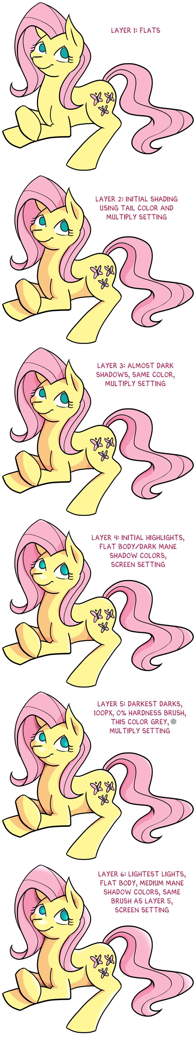
First example: First draw the pony and put your base color down. Then separate your shading into seven stages on separate layers, they are:
Layer 1: Initial shadows
Use a hard edged brush
It sounds counter intuitive, I know... shadows are supposed to be fuzzy is a lie your brain tells you and takes a lot of practice to pull off fuzziness. (To contradict myself, later on, you will learn when shadows are fuzzy and when they are not, but it is very circumstantial and learning it is entirely dependent on practice)
You start with a hard edge so that you:
- Have the ability to come back to the shadows later an fuzzify/refine their edges. The blocking out is really just placement. You want these shadows to come all the way to the edge, getting darker and darker towards the edge opposite the light, with the exception of the silvers of reflected light, otherwise it just looks like spraypaint. By using a hard brush you are not limited by the size of your brush for the crispness of turns (such as within a triangle shaped shadow).
By blocking out and coming back later you are able to have a shadow shape that can both transition sharply from a light to a dark as well as have a gradual transition. The sharp transitions can describe sharp edges like the turn of an ear and the gradual transitions describe rounder edges like the cheek of a face. Also, knowing when to transition sharply can help you to separate say the chin line from the neck line. Both of these are usually in shadow, but if they transition sharply and are different shadow shapes then you don't have the need to artificially place reflective light in there to tell the viewer that these two parts are distinct. - By blocking out you have a definite idea of where the shadows are and aren't. While later you will be able to start with a fuzzy brush, the true ins and outs of shadow technique are easier to learn if you don't have a default fuzziness messing things up for your technique.
Where do you put shadows?
First decide on a light source. Throwing down an arrow on an extra layer reminds you where the light is coming from. In the daylight, the light is always coming from above, so underneath the shadows are dominant.
Set your layer to multiply and try using a lighter variation of the complementary color to your initial base color. In color theory, this makes a dull color that recedes optically into the distance. For illustration's sake, here is a pic by Hobbular that shows the contrast between using a color for a shadow, and just sticking with a grey:
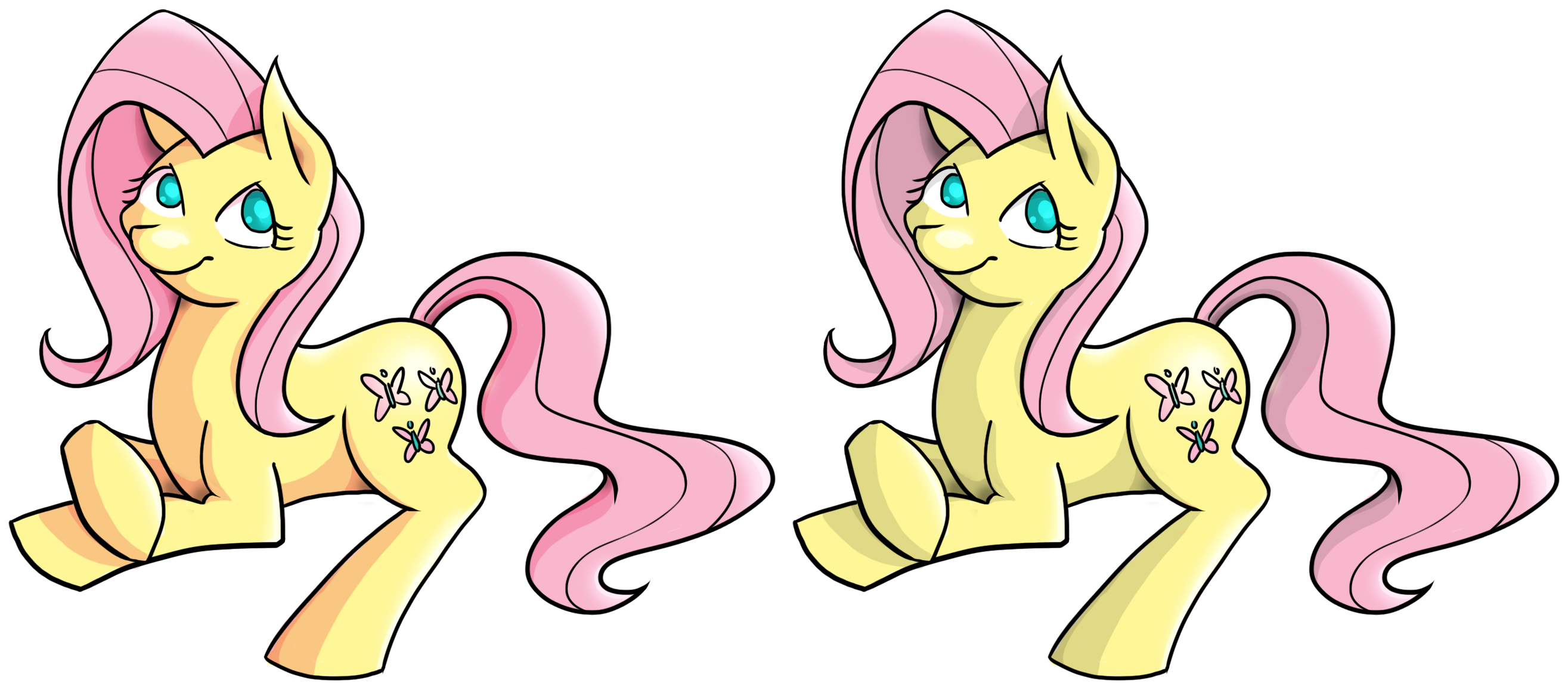
Any color is possible, but complimentary or a color similar to the base works well. The important thing is that it has to be different enough from the base color to be seen.
Now that you have your brush, block in your shadows. Keep in mind here that the shadow/light ratio is only rarely 50/50. Let one dominate the other. Also shadows are a shape, not a series of lines.
You may want to vary the opacity of the layer depending on how contrasty it ends up after this. These are just the first shadows, meant to say this is where the light is not not this is where there is dark.
Layer 2: Almost dark shadows
These shadows are contained entirely within the initial shadows. The color technique for these vary, from a more opaque compliment to a darker cooler color. As far as texture goes, its ok to be fuzzy here (the contrast between this and the hard edge of the initial shadows should give you some good intuitions on just how hard/fuzzy you want the initial shadow edge to be)
Layer 3: Initial highlights
These generally don't contrast too much with the base color, but enough to see they're there. You can use a whiter and warmer version of the base color here. Now when putting these down, remember the no 50/50 rule? A similar thing applies here. If you're initial shadow makes up 20% of the drawing make sure that the initial highlights vary by greater than 10% of that, meaning at least 30%+ or 10%- Highlight and shadow fall differently and the minds eye expects this.
Layer 4: Darkest darks
Use a very dark color here. If you must use a black, then so be it, but be aware that black and white draw a ludicrous amount of attention to themselves. These are used to show where the character is resting. The human eye expects the darkest shadows to be on the ground. (opposite the sun and most light sources, who'd of thought?) In most cases in the daylight this should never be more than 10% of the volume of the whole piece. Dark provides a ground for your character to rest upon in the minds eye. These shadows are just a sliver. They hide where shapes overlap and where the characters rest.
Layer 5: Lightest lights
These really make the piece seem finished, they can draw your attention to a focal point or make your eyes dart around the page. Also I've found that these highlights really define the initial impression of the texture of the piece you are working on, especially if wet. Very little of the piece should ever be white.
Layer 6: Reflected light
Bonus! This is light that bounces off of a surface from another object onto the character. You will notice that shadows don't start dark and then get progressively darker as you move from the center of a character to the outside. This little bastard is the reason why. Edges often have their own unique lighter than almost dark, but different from initial shadows light to them. Representing this varies so greatly in texture and shade that I cannot fathom covering it here.
Layer 7: Texture
This isn't really another layer, this is manipulating edges and your type of brush. This is unique among artists. It is where you define yourself and separate yourself from others. Shadow shape and outline lines (as well as shadow lines and outline shape) all have the ability to express texture. For you I'd play around with harder edges/more contrast. The idea is to exit your comfort zone, try new things Fail miserably and learn from the whole experience.
Visual Guide
Hobbular has illustrated an interpretation below. This is one way to interpret what I've said here, but there are a thousand ways.
Conclusion
I encourage all of you to look at other artists shading, especially ones that look completely different from anything I've said here. Try to figure it out yourself. Ask how to do it. This guide can always be appended.
If I glossed over anything or anything is unclear, or you'd like to know any particular technique, ask.