 Another shading guide?
 When will it end?
Ponies are made up of simpler objects than you would think. By simplifying how ponies are put together you can easily figure out where shadows go and how they look. Spheres, cylinders and cubes. That's really all a pony is. Think of digital cgi mapping, simplify your shapes then use how you know how to shade simple shapes to shade comlicated pony shaped shapes. Use your undersketch as a guide, once again, but this time in 3d!
Shadows Within Shadows
I keep saying there are shadows within shadows, but what do I mean? And how do shadows fall on simple shapes?
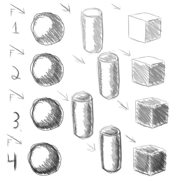
Well I put together this here set of examples to show how simple shadow shapes are:


Numbers correspond to rows in the pictures.
1. Main shadows
This is usually where newer artists stop. One shadow, one shade, very boring... dull and lifeless. Shadows have depth. There are shadows within shadows. Notice, the shadow doesn't go all the way at the edge. This is because whatever the object is resting on will reflect light back up into the object. This really helps to give the objects a 3d look. Notice also how the highlights aren't touching the edge. That's what the F is for. Light is either in front of or behind an object. To put it directly to the side is... sad and makes it look much more 2d.
2. Secondary shadows
Let's look at the circle for this. Look at how the shadow is a different thickness as we go about the circle? Inner shadows are never parallel to the initial shadow on living forms. On a perfect cylinder, maybe, but that's not a living form, is it? Shadows are closer together in areas of quick change (such as the edge) and further away in areas of gradual change.
3. Tertiary shadows!
 This is all too much!
These here help things look more three dimensional. Shadows within shadows within shadows. As we increase in depth away from the light source the shadows increase in darkness. Now, why on the cube are my shadows not going to the edge? Because there is no such thing as a perfect cube and edges are ludicrously important. A hard edge of one value meeting another indicates a quick change in the object's plane. Notice how the edges get darker as we progress?
4. Darker shadows
These are the ones that really make your objects pop. They should follow a similar pattern of shadows within shadows but these take up very little space. Your darkest darks and your lightest lights will always draw the most attention. These are important, but should take up very little space overall and need a proper transition. If there is a gentle sphere, take your time, if it is a quick angle, transition quicker.
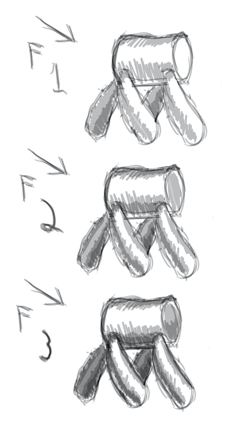
The second image is an example of pushing things that are behind back. The back cylinder things are behind, so they start with a darker initial value. Never be afraid to darken a whole spot if it is in shadow. Something cast in shadow looks farther away and makes the whole piece look better by just using a simple change in initial value. Push things back to bring other things forwards.
Edits
Our heads often draw too much distinction between highlights and shadows. Here the body midtone is represented by the initial shadow. The lights/highlights are the white. A light source is implied by every line. Outline, reflected light, highlights, shadows. Every. Last. Line. This is why consistency of light source is so important. Our eyes recognize it immediately, even if our conscious does not.
Or I could say that #4 is the body midtone and most everything is a highlight. Or I could say that the white is the midtone, but the light source is the sun and the highlights are the midtone. The difference between shadow and highlight is pretty arbitrary. Scary, I know, but it is true. All the ponies start out with a body color and we call darker than that a shadow and lighter a highlight, but this distinction is really artificial.
There is a lot of change in an organic form towards the edge. This is true for cylinders and spheres.
 Why is there always more!
The closer our eyes get to the edge, the more is happening. The line of light that you see on the edge is both reflected light and a quick change to the normal part of the sphere where the light isn't reflected.
Questions, comments, concerns, and criticisms welcome.
