It is always quite frustrating to come back to a finished drawing and to see something blatantly and obviously awkward.
 That questions thing is coming up a lot lately, I wonder if there's something to that?
"How didn't I see that?"
Well, seeing in art takes time and practice, but being aware of signs and symptoms for awkwardness and asking questions helps get your mind thinking in the right direction.
Identifying awkwardness is about being able to see, while this comes with time and references to understand anatomy, consistency is a good way of identifying awkwardness.
The biggest thing about identifying this all on your own is to ask yourself questions to find consistency in your own works.
Questions to Ask
Pony Questions
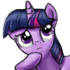
- Are the eyes the same size? Should they be? (In the show, 3/4 view eyes retain the same height, but the far eye is always thinner). Are the irises the same size? They should be. What about the curves, are they consistent? Or do they wave about? Guidelines can help you to make the eyes more symmetrical and even and going over a line again and again can help to smoothen it out.
- Does the jawline look right? Is it longer than references with the same openness of mouth or is it shorter? Compare. Over and over, compare.
- Are the legs the right height and thickness? Often times artists make the legs too stubby or too thin and hooves really are the widest lower part of a leg. Use your reference, even if it is a completely different pose and pony. Are yours thinner or thicker than the reference's? Taller or shorter?
- Big question to ask yourself are all anatomy points there and are they all accurate? References help a great deal for this but you can also use the knowledge you already know.
Composition
- Edges. Is it hard for your eye to follow along the side of the pony? Are the edges all over the place? Can you tell where the part you're working on ends and another part begins? Sketchyness is awesome and active, but vagueness keeps us from being able to tell where a thing is. Edges define a shape in our minds.
- Tension. Have you squished anything to fit it where you think it should go? How does it look? What would you have to change to make things more correct in proportion? Sometimes things just go off the page and never fear overlap. Overlap makes things interesting.
- Do things flow together? Does the front line of the chest look like it leads into the stomach line? Does the haunch overlap into the body or does the body overlap it? Is it clear where the arm attaches or is there no overlap?
Drawing Technique
- Symmetry. Flip the canvas or hold the piece up to a mirror. What flaws become obvious then? Changing your perception like this opens up everything and shakes up preconceptions about your work.
- Are the lines shaky? Shaky lines mess with our understanding and interfere with our ability to comprehend the piece. Sketchyness on the other hand does not.
- Do the beginning and ending of a line have the same angle when they're meant to be separate? This can feel confusing for the viewer.
- Comparing to a reference. Are your lines in the right spot? Breaking down the reference into separate shapes and comparing to yours helps infinitely.
 I've come to realize how important the process of asking questions is to the creative process so I'm trying to format my guides to encourage introspection.
 As always, your additions and confusions are welcome.
 My guides are getting more vague and less good... this is bad.
 Help
Helptest
