Variety! A tool of interest.
 Another guide... I'm Twilight Sparkle and I'm here to help you along!
 Ah mine as well help out too... sounds fun
 Applejack?! A... are you sure?
Something that I often say in critique is that you need more variety in a specific part of a piece. Variety in the values! in the placement, sizes of shapes! But what adding variety means is entirely complex. Variety how?
 Different things are different.
 Thank you, AJ, for that... in depth... analysis.
Variety in art is something to Balance. A matter of how much of an element, where, and how?
Variety in...
Value
This one is a shading miracle. The 17th bi-weekly covers it compositionally, but it's also is important in your pony as well. Approach each limb/section a little differently. Make sure that there is enough of a change in value as we go from one part of another to see that they are different. This is the difference between a flat pony and one that is just a little different:
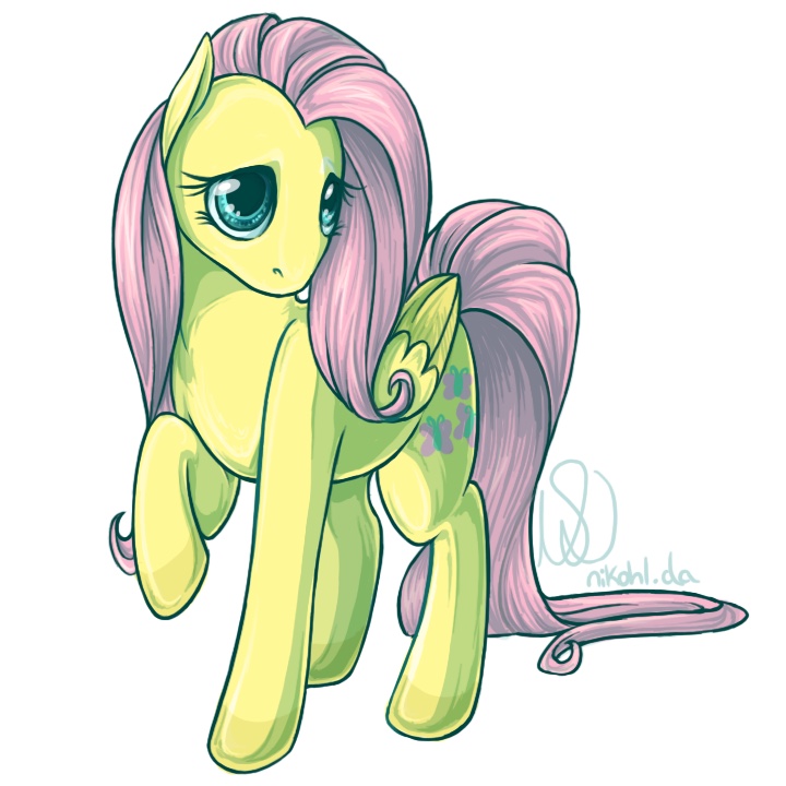
Highlights, shadows and in betweens all there, but in slightly different sizes and unified together as being similar... there's that balance again.
Placement
For figure, again, approach each limb/section differently. A standing pony with all legs straight down may be orderly, but it certainly isn't interesting. A little change in each limb adds a lot of movement and interest to the pony:
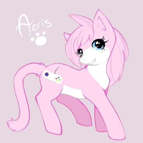
And you can do this for a whole composition or pieces within a composition.
Shape sizes
This one is especially noticeable in hair.
 References, references, references.
Hair isn't a regular set of spikes, though the brain does like to think of it that way. Take a look at Dash's hair here:
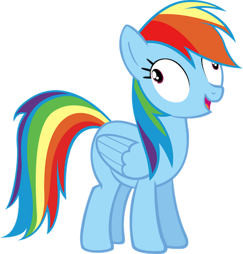
Each tail and hair spike is a different size or different pointyness, but they still seem like the same style. Unity with variety... balanced together...
Unity / Harmony
 Unity is a method of similarity normally, but this guide is about variety, thus this is the combination of unity and variety in a way that achieves bala-
 Twilight... could ya at least try and speak normal like?
This is making shapes belong together but still look different overall. There are different ways to do this depending on the kinds of shapes you're putting together. Suffice to say things have to look like they belong stylistically and as a part of the same thing, but still be different enough that they are different objects.
 Different things... are different...
 Told ya!
Let's look at this picture:
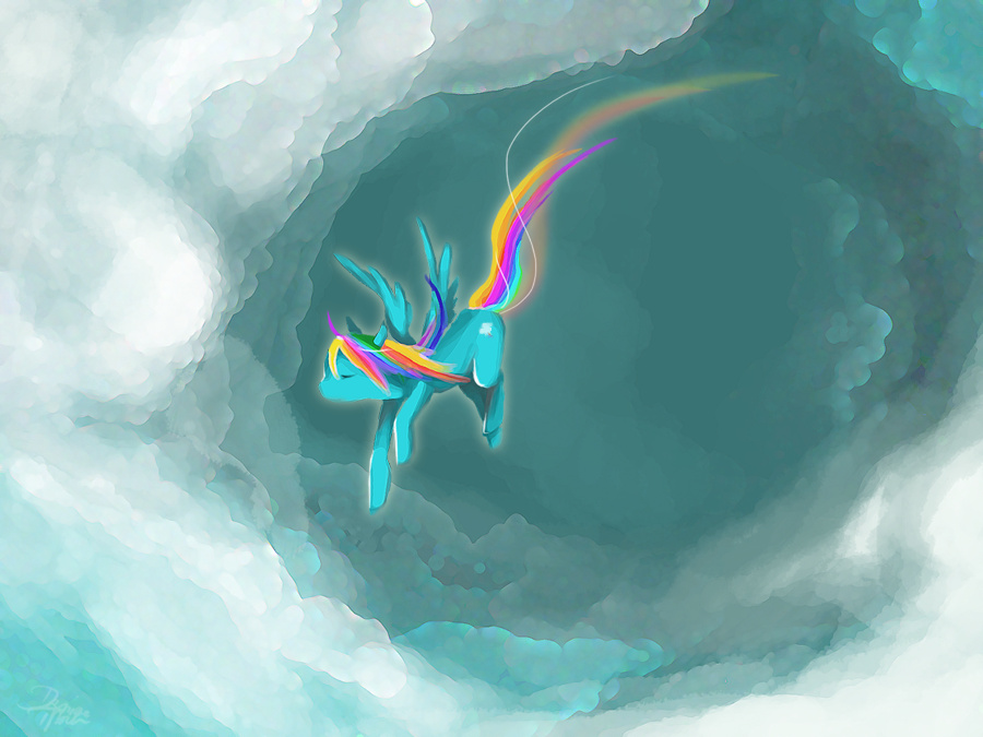
The cloud shapes here are a good example of keeping things similar enough that they look the same, but various enough that they're different clouds and create space.
Repetition / Patterns
Repetition, patterns, strong horizontal and vertical lines all create stability.
 Patterns... everywhere...
 Augh...
They conform to our brain's idea of order and are nice ways to add this order to a piece of art. Fortunately/unfortunately our brains tend to make this order as a default. This order is also very boring on its own. So it is the job of variety to break up the monotone of patterns and bring interest in. The cloud swirls in this piece all look similar, and kinda patterned, but they are various enough to not trigger something looking artificial rather than organic:
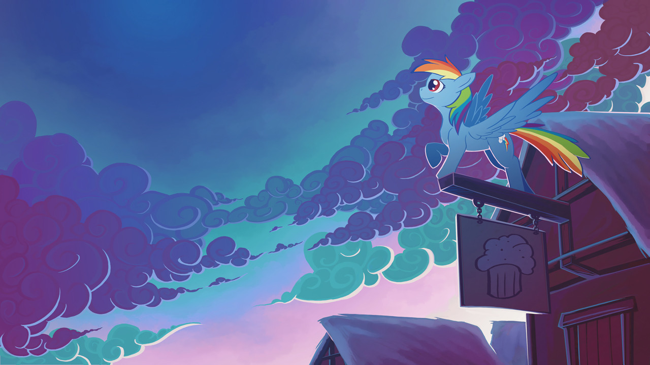
Organic vs. Created Spaces
Variety in man made objects is just as important as variety in organic things. Organics vary in size, shape and everything quite naturally. In sharp contrast artificial space and objects like buildings, fences, bricks and other man made objects are quite patterned in a rigid manner that doesn't lend itself easily to variety... at first glance.
Take a look at the wall in this piece:
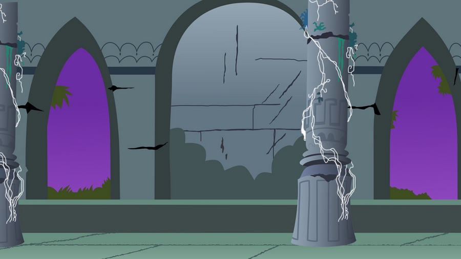
Adding perspective, shading or foreground objects in front of or choosing not to describe every brick can add all important variety to a part of a composition.
Contrast
Variety in contrast is fun. Like variety in value, variety in contrast is about approaching each part of the pony differently. Different sizes of shadows and highlights. Different speeds of transition from shadow to highlight. It all depends on your light source and the way your pony is positioned. Experiment with things. Have some fun! A nice varied-contrast piece for example:
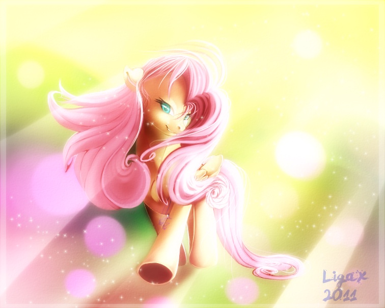
Accents
 Accents, ah got this one.
 It's not that kind of accent...
Accents are little things, just a bit, but they add a lot to a piece. For example, small white lines to break up large areas of other colours, etc. Variety in accents is knowing not to do the same exact shape and size for every accent – but still making them look unified... see a pattern?
Balance
 Not more balance...
 Balance binds everything together...
Every piece, part, big theme and whole composition that you create should have variety and unity balanced. Big things, little things and all sorts of medium things are welcome. Diagonal, horizontal and vertical too. Anything you can think of. But in balance. How? That's a matter of being able to see. A difficult thing to 'see' one's own work, which is why we use mirrors to flip the piece or come back to it after a time with fresh eyes. Now you have the tool of variety to help you solve those problems. Have a strong horizontal line? Break it up with something in front of it... or more horizontal lines or a vertical one... or some diagonal ones... or fade it out... or take it out. There are always more solutions and they're largely variety based.
Conclusion
To sum up:
Variety is all about approaching the same "problem", element, or area in a piece and coming up with a solution that is slightly different than your last for the same problem.
 Ah, that's easy.
 NO!
NO!